The Card Area
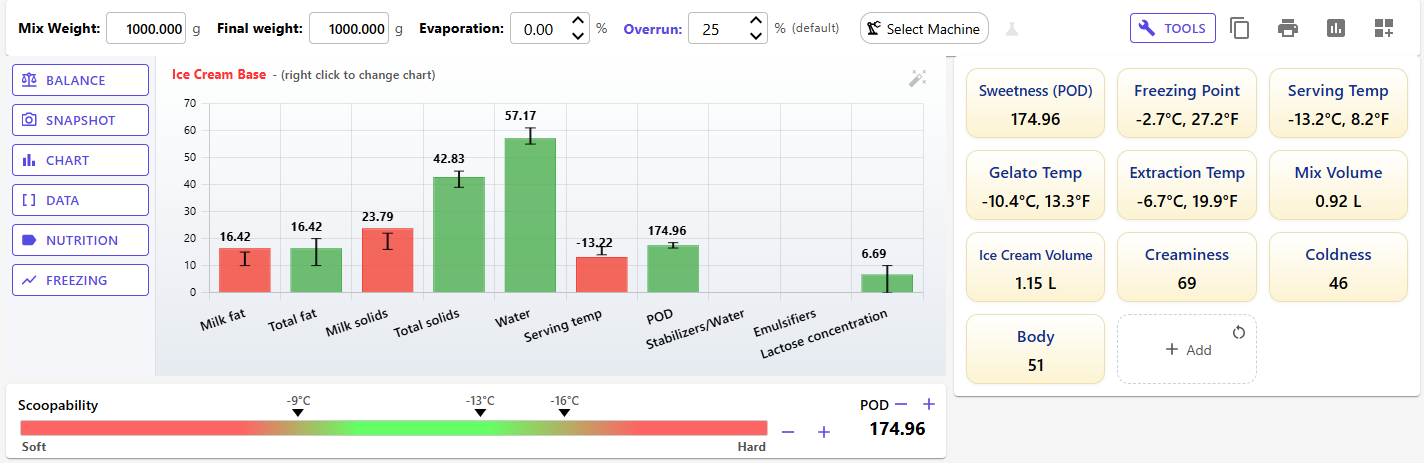
Below the ingredient table and the weight row, the Recipe Editor shows cards: the chart, the scoopability bar, your data tiles and more. You decide which cards appear, how wide they are and in what order, with Customize layout.
- The Chart card is always first. It can't be removed or moved, but you can choose its height.
- Each card appears once. You can add any card that isn't placed yet.
- Your layout belongs to your account, not to a recipe: every recipe you open uses it, on every device you sign in on.
- Guests can arrange the cards too, but the layout lasts only for the current session.
- Customizing the layout is free; only the Sugars card is Premium.
The Standard layout, which you start with, has the Chart with Scoopability below it, and Recipe Data beside them on wide screens.
The Cards
Most cards have a title bar with small buttons at the right. Three cards let you choose what they show: Data table (its values), Nutrition (its sections) and Tools (its tools). Your choice is saved with your layout at once.
Chart
The recipe's chart with its sidebar: Balance, Snapshot, the Chart menu, Data, Nutrition and Freezing. It is always the first card in the first group, and its height is Small, Medium or Large (320, 400 or 480 px). See Recipe Editor and Charts.
Scoopability
The scoopability bar, from Soft to Hard, with markers for your serving temperatures and the − (softer) and + (harder) buttons, plus the POD card with its own −/+ buttons for sweetness. See Understanding Scoopability and Serving Temperatures.
Recipe Data
Key values as tiles. By default: Sweetness (POD), Freezing Point, Serving Temp, Gelato Temp, Extraction Temp, Mix Volume, Ice Cream Volume, Creaminess, Coldness and Body. The Add tile adds values from the data browser, and its corner icon resets the tiles to the default set. Drag a tile to move it, double-click it to rename it and set a range (green inside, red outside, yellow without a range), and use its bin icon to remove it.
Freezing Curve
A small version of the freezing curve: the freezing curve and the hardness curve against the share of frozen water, the shaded serving zone, and dots for your ice cream and gelato serving temperatures. The expand icon (Open the full freezing curve) opens the full page. The card keeps its 4:3 shape.
Data table
The recipe's key values as a compact table. By default it shows the Overview values of the recipe data browser, grouped as Composition, Sweetness & Freezing, Texture, and Volume & Cost. The rows flow into more columns as the card gets wider.
To show your own values, click the tune icon (Choose the values). In the Data table values dialog, click Add values to pick from the data browser, drag the rows into order, remove a row with ×, or click Use the default set. Then click Save. Your own values show in your order, without group headings.
Nutrition
What the recipe's label would say, using the same values as the nutrition label page. It can show four sections:
- Ingredient list, with allergens highlighted;
- Allergens: the allergens as chips, a "May contain" line and any other warnings;
- Nutrition declaration (EU, per 100 g);
- Nutrition Facts (US, per serving), with % Daily Value.
The first three show by default. Click the tune icon (Choose what the card shows) to tick the sections you want and drag them into order. The expand icon (Open the nutrition label) opens the full label page. See Nutrition Labels.
Description & Notes
The recipe's Description and Technical Notes, a tab each. Click the text, or the edit icon, to type; click outside the box to keep the change. These edits go into the editor's working copy, so Save and undo apply to them, as for any other recipe change. Height: Small, Medium or Large.
Instructions
The recipe's method, as groups of numbered steps. Click the edit icon, or Add instructions when there are none yet, to open the instruction editor. Instructions are stored as soon as you click Save & Close there: they are not part of the Recipe Editor's Save or undo. Height: Small, Medium or Large. See Recipe Instructions.
Cost
What the recipe costs. A ring chart shows each ingredient's share of the cost, the most expensive first: the four largest get their own slice and the rest are grouped as "others". The cost per kg is in the middle. Below it you see the cost of the Batch, a Liter of ice cream and a Serving (your serving size from Settings).
All ingredients count, infusions included. Amounts have no currency symbol, like the rest of the editor. Ingredients without a cost per kg are listed under "No price"; water is free and isn't listed. With no prices at all, the card tells you to add a cost per kg to your ingredients.
Sugars (Premium)
How each sugar in the recipe contributes. Three bars show each sugar's share By weight, By sweetness (POD) and By softness (PAC). Dextrose, for example, is a small share of the weight but a large share of the softening. A table beside the bars, or below them in a narrow card, gives each sugar's % of the mix, POD and PAC.
The card also shows total sugars, how much of the sugar composition is known, and the lactose in the water, with a warning when lactose could crystallize and feel sandy. Free users see a placeholder with an Upgrade to Premium button instead. See Sugar Composition.
Tools
The tools of the editor's Tools dialog as buttons that are always at hand. By default: Produce, Print, Mix volume, Ice Cream Vol., Milk/Cream, Evaporate, Flavor Profile and Reports. Click the tune icon (Choose what the card shows) to pick other tools and their order: Final Water %, Stabilizer Ratio, Save as Ingr. (or Edit Ingredient), Overrun, Export JSON, and your Python scripts with Edit Scripts. Python Scripts are a Premium feature. Evaporate looks greyed out until you select an ingredient in the table.
A tool runs exactly as it does from the Tools dialog. See Recipe Editor and Tools Overview.
Choosing a Card's Sections or Tools
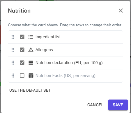
For the Nutrition and Tools cards, the tune icon opens a list of everything the card can show:
- Tick what you want and untick what you don't. At least one must stay ticked.
- Drag a row by its grip to change the order.
- Use the default set puts back the card's standard choice.
- Click Save.
Customizing the Layout
Opening the Designer
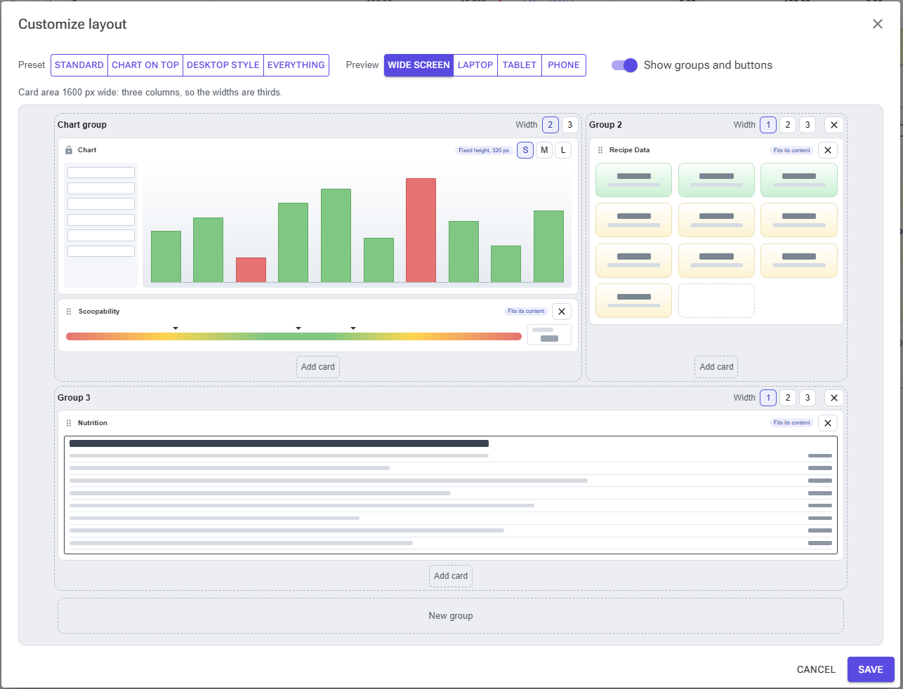
Click Customize layout, the dashboard icon at the right end of the editor's weight row. The designer shows your layout on placeholder cards: sketches that show each card's shape and size, without your recipe's data.
Presets
A preset is a ready-made layout. Click one to start from it, then change what you like:
| Preset | Cards |
|---|---|
| Standard | Chart with Scoopability below it; Recipe Data beside them. This is the default. |
| Chart on top | The Chart on a row of its own; Recipe Data and Scoopability side by side below it. |
| Desktop style | Like the Desktop app: Chart with Scoopability, and the Freezing Curve beside them; Recipe Data and the Data table on the row below. |
| Everything | Every card at once. |
The preset button stays highlighted while your layout still matches it. Applying a preset keeps a card's own settings, such as the Data table's values or the Nutrition card's sections, when the preset includes that card.
Preview Widths
The card area arranges itself by the space it has, so the designer previews four widths:
- Wide screen (card area 1600 px): three columns.
- Laptop (1200 px) and Tablet (900 px): two columns.
- Phone (390 px): one column, the chart first. This preview can't be edited; choose a wider preview to make changes.
A line above the preview explains what the chosen width does with your groups.
Groups and Widths
Cards sit in groups: columns of cards stacked on top of each other. Groups fill rows from left to right; a group that doesn't fit on the current row starts a new one.
Switch on Show groups and buttons to edit. Each group then has a bar with its name (Chart group, Group 2 and so on) and Width buttons:
- 1: a third of a wide screen; half on laptops and tablets.
- 2: two thirds of a wide screen; half on laptops and tablets. The Chart group is at least 2 wide and takes the full width on laptops and tablets.
- 3: a row of its own.
When a row isn't full, its groups share the space that's left, so a group alone on its row takes the full width.
Click New group to add an empty group, or drop a card on it to give that card a group of its own. The × on a group bar (Delete group) deletes the group; its cards can then be added again. The Chart group can't be deleted. Empty groups show only in the designer and are not saved.
Adding and Removing Cards
- Click Add card under a group and pick a card from the list. The list offers only cards that aren't placed yet.
- Click the × on a card (Remove card) to take it out of the layout. You can add it again later.
Card Heights
Three cards have a height you choose, with the S, M and L buttons on the card:
| Card | S | M | L |
|---|---|---|---|
| Chart | 320 px | 400 px | 480 px |
| Description & Notes | 140 px | 230 px | 360 px |
| Instructions | 230 px | 360 px | 480 px |
The other cards are as tall as their content. The Freezing Curve keeps its shape; on a wide screen, next to the chart, it fits the chart's row instead of making it taller. On phones, every card is as tall as its content.
Moving Cards
Drag a card by its grip to move it within its group or to another group. Drop it on New group to give it a group of its own. Nothing can go above the Chart, which shows a lock ("Always shown, always first").
Saving or Cancelling
The designer works on a copy of your layout. Click Save to apply it in the editor and store it; click Cancel, or close the dialog, to leave your layout as it was.
How the Layout Adapts to Your Screen
In the editor, the number of columns follows the width of the card area, not your settings:
- Three columns when the card area is about 1280 px wide or more: groups take the widths you set.
- Two columns from about 850 px: every group is half or full width, and the Chart group is full width.
- One column below that: every group takes the full width.
- Phones (768 px wide or less): one column with the cards in your order, the chart first, each as tall as its content.
Tips
- Start from a preset. Pick the one closest to what you want, then add or remove a card or two.
- Keep your most-used card next to the chart. On a wide screen, a 1-wide group beside a 2-wide Chart group sits on the chart's row.
- Use the Wide screen preview to edit, then check Laptop and Phone to see how your layout reflows.
- Add the Instructions card if you write methods often: only the Everything preset includes it.
- Use the Tools card for the tools you run on every recipe, such as Produce or Print, instead of opening the Tools dialog each time.